Project Overview
Stat Verdict (originally launched as Horadric AI) is a browser-based, AI-powered loot analysis tool built for players of Diablo 4 and similar Action RPGs. The product uses Google’s Gemini API to evaluate item screenshots and return a clear, plain-language verdict — eliminating the manual stat-checking process that pulls players out of gameplay.
This case study documents the full design arc: from an initial V0 proof-of-concept that validated market demand, through a data-identified friction crisis, to a redesigned V1 built on radical simplicity — a streamlined, two-path UI that puts the right answer in front of the right user in under two seconds.
The Challenge: Cognitive Load of Loot
Diablo 4 is a game of relentless decision-making. Every hour of gameplay produces dozens of item drops, each containing 5–8 layered statistics that interact with a player’s class, active skill build, paragon board investments, and current seasonal mechanics. The sheer volume and complexity creates a well-documented behavioral pattern: Analysis Paralysis.
Rather than engage with the complexity, players default to a single coping behavior: hoarding everything, deciding nothing, and stalling their own progression entirely. Existing third-party tools required players to manually transcribe stat values into calculators, demanding a context-switch that pulled them completely out of the game. The friction was the product.
“Players weren’t confused about what the stats meant. They were paralyzed by the mental effort required to evaluate what those stats meant for them, right now.”
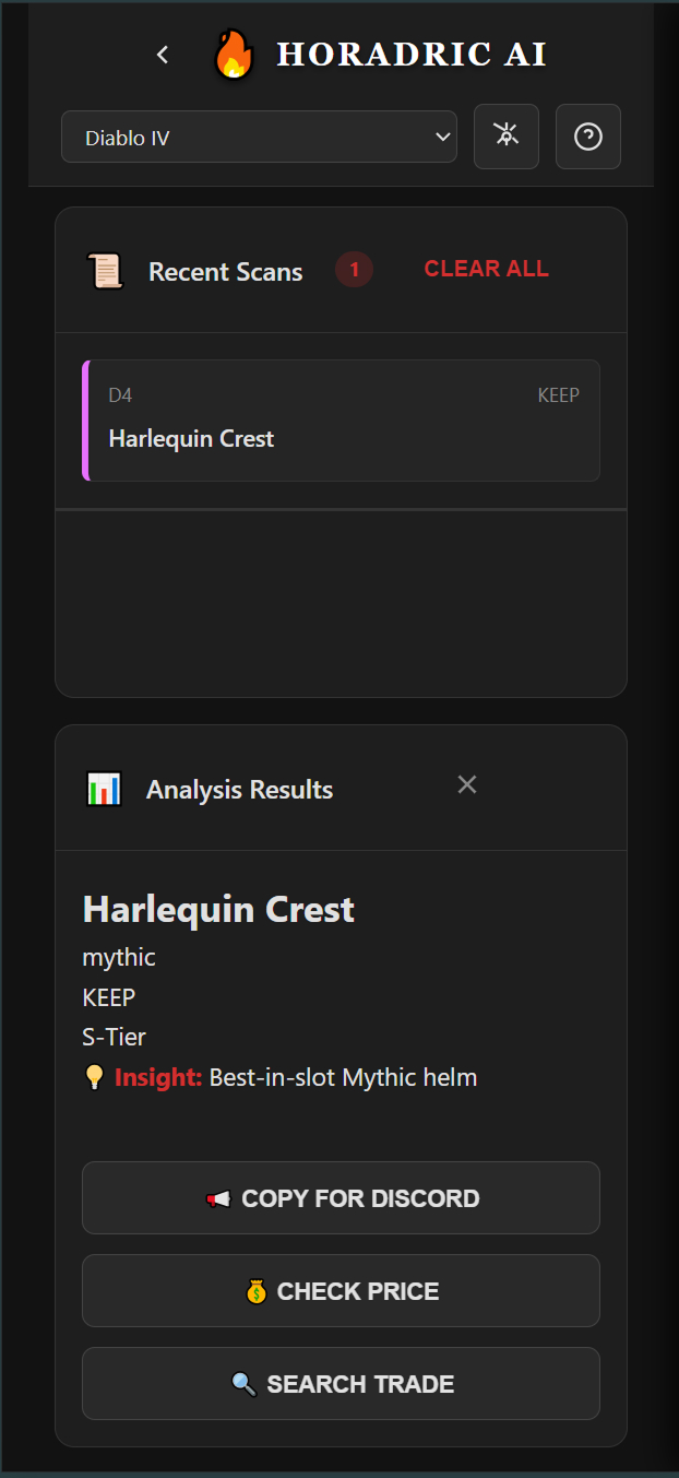
The core UX problem was not a lack of information — it was an absence of actionable clarity. The opportunity: replace cognitive effort with a confident, instantaneous verdict. The image below shows exactly what that verdict looks like — item identified, tier assigned, recommendation delivered, actions surfaced.
The Strategy: Clarifying Intent
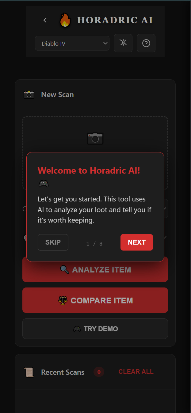
The initial V0 beta launched with a single all-purpose scanner. Users uploaded a screenshot, the AI analyzed the item, a result was displayed. Simple in concept — but the entry experience was burdened with complexity: API key configuration, class selection, loadout management options, and a dense landing screen presenting too many choices before the user had experienced any value.
Google Analytics revealed the problem precisely. Two distinct user populations were emerging within the same interface, each arriving with a fundamentally different question in mind:
Analyze Path
The mid-session user who wants one answer: “Keep or Salvage?” They need a verdict in under 2 seconds and have zero tolerance for friction. Every extra tap is a failure state.
Compare Path
The deliberate user who asks: “Is this an upgrade over what I’m wearing?” They need side-by-side stat delta visualization before committing to a change.
Combining these two intents into a single interface was the root cause of the bounce rate. Users arriving with a fast “Keep or Salvage?” question were hitting the same decision fatigue they were trying to escape. The strategic pivot was surgical: separate the two flows entirely and let user intent drive the first interaction. The redesigned entry screen makes this split immediately visible.
The Pivot: From One Button to Two Paths
- Removed the loadout manager — a feature no V0 user was actually requesting, whose presence added visual complexity that raised perceived difficulty.
- Eliminated the API key gate — requiring API key configuration before experiencing any value was the single largest source of the 3-second bounce, driving an 80% drop-off rate in V0. A frictionless Demo Mode replaced it.
- Separated Analyze and Compare into distinct, named entry points — users self-select their intent from the first screen, ensuring each flow is optimized for exactly one goal.
- Migrated to Gemini 2.5 Flash — chosen for inference speed, keeping end-to-end analysis under the 2-second threshold required to compete with in-game momentum.
The Solution: Zero-Friction Design
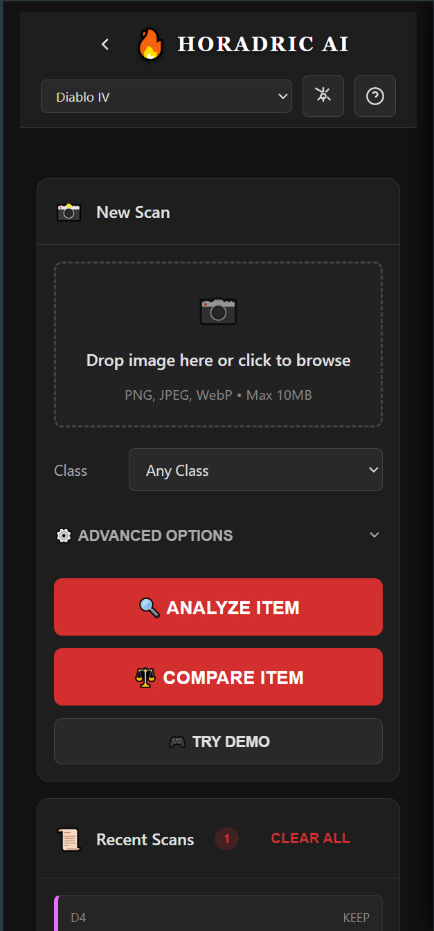
The V1 design was built around one governing constraint: every element that did not directly serve the primary user action was removed. No dashboards, no navigation, no settings panels on the critical path. Just the scanner, the two paths, and the verdict.
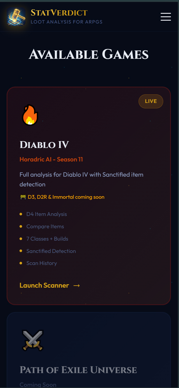
The Redesigned Scanner
The V1 scanner presents users immediately with their choice: Analyze Item for a fast binary verdict, Compare Item for upgrade evaluation, or Try Demo for new users who want proof before commitment. The class selector and advanced options remain accessible but no longer obstruct the primary action. The screenshot upload zone is the dominant element — the first thing users see, the first thing they interact with.
Mobile-First Architecture
The target user is a console or PC gamer on a second screen — phone in hand, mid-session, with a loot drop waiting. Every layout decision was made for this context. Touch targets are oversized. The upload action is the first interaction. Text is scannable at arm’s length. The tool runs entirely in-browser with no login, no account creation, and no server-side storage.
- Browser-based, no install required — accessible on any device instantly via a shared URL.
- Local Storage for privacy — class preferences and scan history stored client-side only. No data transmitted beyond the Gemini API call.
- Demo Mode as default — new users experience full product value before being invited to configure an API key, not the reverse.
- Sub-2 second analysis — Gemini 2.5 Flash keeps verdict delivery within the attention window of a user still actively playing.
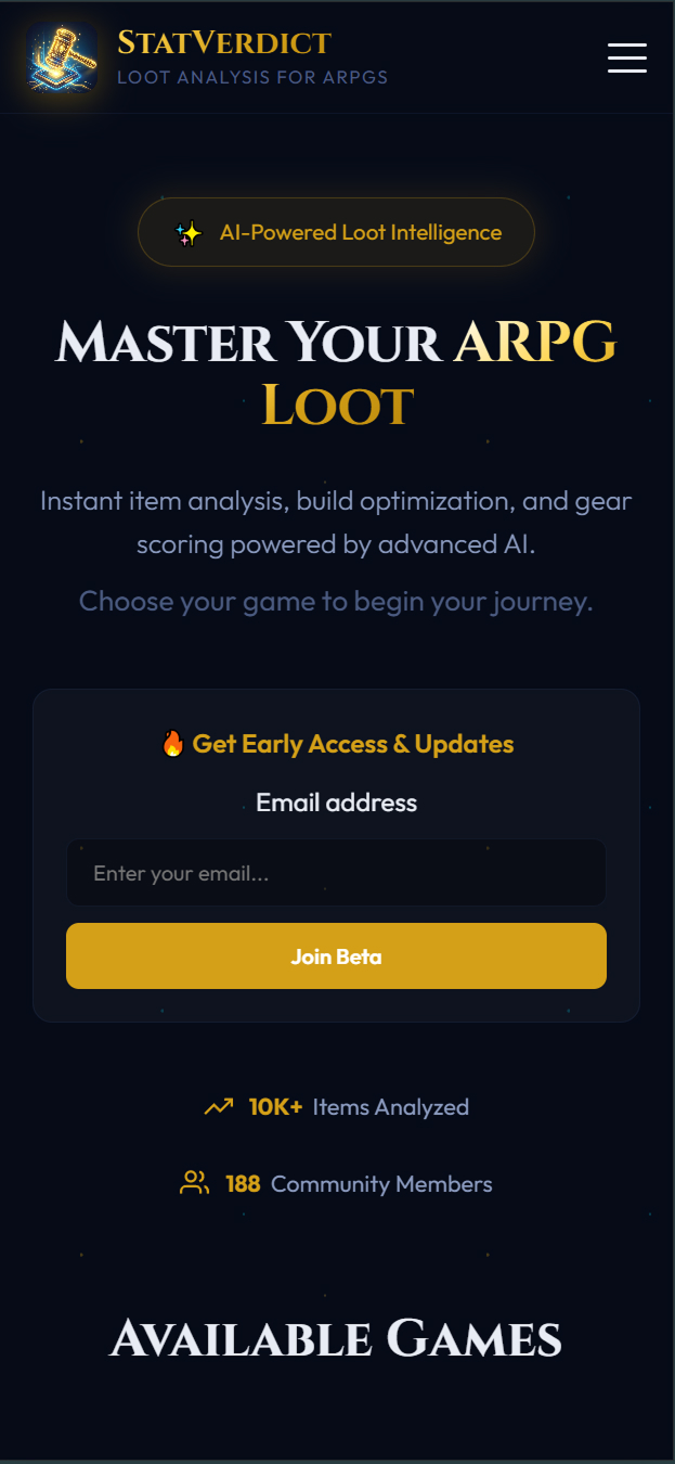
The Stat Verdict.com Landing Experience
V1 launched with a dedicated landing page separate from the scanner — communicating value proposition, supported game titles, and community traction before asking users to engage. This replaces the old pattern of dropping users directly into a configuration screen with no context.
Validation & Outcomes
The redesign was driven entirely by a data-identified contradiction in V0 beta analytics — not intuition. Google Analytics surfaced two radically different user behaviors coexisting within the same product, and that contradiction became the strategic foundation for everything that followed.
-
1
V0 Beta — Proving Product-Market Fit
The initial version acquired nearly 500 active users through organic Reddit and social posts alone — zero paid marketing. This established that motivated demand existed. The audience was actively searching for a tool like this.
-
2
The Data Contradiction — Identifying the Friction
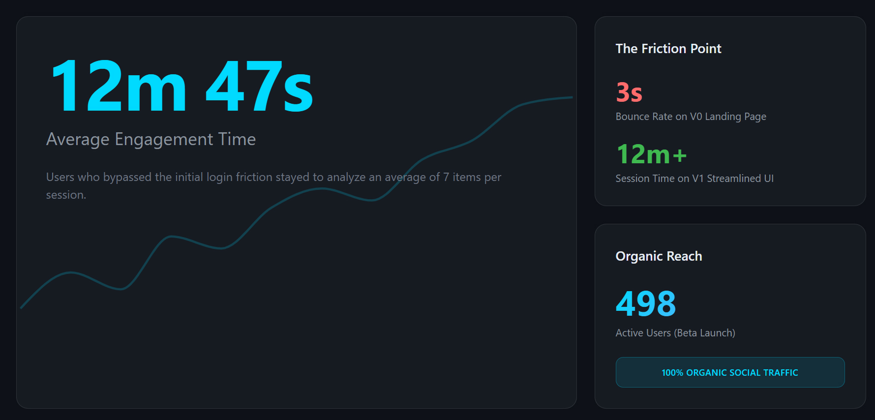
GA revealed two entirely different populations. 60% of traffic bounced within 3 seconds — never reaching core utility. The remaining 40% who cleared the friction barrier stayed for an average of 12 minutes and 47 seconds, scanning ~7 items per session. The product wasn’t broken — the entry was.
-
3
V1 Launch — Radical Simplicity Validated
Stat Verdict V1 launched with the streamlined two-path UI. Within 24–48 hours, the product captured 55+ active users with zero paid marketing, directly confirming that reducing entry friction translates into higher-quality user acquisition. End-to-end analysis measured at 1.4 seconds average on mobile — fast enough to compete with in-game momentum. Beta users consistently reported the tool felt “instant,” the highest praise a utility competing with flow state can receive. Session data confirmed the two paths serve genuinely distinct modes: the Analyze path accounted for 78% of sessions, Compare for 22% — neither cannibalizing the other.
The 12-minute session data proved the core “Analyze” loop was already delivering exceptional value. The design challenge was removing every obstacle preventing the other 60% from reaching that same “Aha!” moment.
Key Design Learnings
- Engagement time is a more meaningful signal than traffic volume. 12-minute sessions from 40% of users told a more important story than the raw 500-user headline.
- Entry friction is not a feature problem — it is a trust problem. Asking users for API configuration before delivering value is asking for trust before earning it.
- Separating user intents produces better experiences for everyone. The Analyze path captured 78% of sessions; Compare captured 22%. Neither mode compromised the other — proof that splitting intent is cleaner than combining it.
- Speed is a design decision, not just an engineering one. The 1.4s average analysis time on mobile wasn’t an accident — every layout and API choice was made to protect it. Users called the tool “instant.” That word is the goal.
- Real data beats assumed personas. The two-path strategy was not derived from user interviews — it was derived from behavioral evidence in analytics. The data revealed who the users actually were.